
Monday 2 May 2016


Wednesday 27 April 2016
Tuesday 26 April 2016
Evaluation Q6 - What have you learnt about new technologies in the process of creating this product?
 When staring to create my article, I found that Photoshop wasn't suitable as I wanted to create a double page contents page. InDesign was more suitable for the layout of my contents page and article than Photoshop would be because of the dimensions. I used InDesign to make my contents page and my double page article. Like Photoshop, I had never used this programme before. InDesign was another technology that greatly aided the production of my music magazine. I found it to be compatible with other technologies of the sort, such as Photoshop. Similarly to Photoshop I had some difficulties figuring out certain elements at first, however through experimentation I once again overcame any problems. InDesign allowed me to integrate text and images in a professional manner.
PowerPoint allows one to create a slideshow of information. When used alongside SlideShare, these slideshows can be neatly presented on a blog, which is what I did throughout the project. Personally I found PowerPoint easy to use as I had previous experience with it, and I found it to be an effective way of portraying information simply and professionally.
 I used slideshare when wanting to upload powerpoints to my blog. Slideshare makes it easier to convert the powerpoint to a one able to be shown on my blog.
 Blogger is a website where you are able to upload posts to your own blog, personalised to you. Having never used Blogger before, I found some elements slightly complicated to learn and remember at first, however I was eventually able to adapt things to exactly how I wanted them. I was able to do things such as change the theme and background of my blog, as well as adjusting the width of my page and deciding how posts should be organised. I could access Blogger from any computer necessary. Blogger enabled me to move from consuming work over the internet to producing work for a potential worldwide audience. I have became a "prosumer".
  Microsoft word was the application I was most familiar with as I use it on a day to day basis. Word is an application designed for writing documents so was perfect to write my article for the magazine.
Soundcloud is an application I was familiar with before the magazine process. It allows you to record yourself and upload to the internet for anyone to listen to. It is an easy way of getting information across without having to write too much.
 Youtube like Soundcloud was a programme I was already very familiar with. Youtube is a website to upload and watch videos. You can upload original content for anyone all over the world.
Monday 25 April 2016
Thursday 21 April 2016
Tuesday 19 April 2016
Evaluation Q4 - Who would be the audience for your media product?
 "At the beginning my magazine was going to be aimed at males between the age of 18 and 30. When making my magazine I came to the conclusion that I wanted my magazine audience is different. The primary audience age range was between 18 - 30 and the secondary audience is older or younger and some females. I wanted to increase the audience so I included female stories and images to target a female audience as well as male. Music magazines are dominated by male readers therefore I wanted to widen his by increasing the female audience. I feel the magazine is now not gender specific as the content fits for both sexes.
 Because my magazine focuses on Indie music, and my research has shown that it attracts a working class/ lower middle class audience. My audience would be largely working class/ lower middle class and in employment. If the audience is in employment that makes it easier to afford seeing concerts, buying music and buying my magazine. The main model and article in my magazine sympathises more with working class males which could attract a male dominated audience. It is clear to see that the audience that would enjoy my magazine the most is people into indie music. This is shown through the content and house style as it was made from inspiration from Q magazine"
Tuesday 12 April 2016

Friday 8 April 2016
Sunday 3 April 2016
Evaluation Q1 - In what ways does your media product use, develop or challenge forms and conventions of real media products?
 ‘’When looking for a style model for my double page article, I also
looked to Q magazine again. Since Q is a similar kind of magazine to the one I
wanted to make I decided to refer to it for help and ideas.
‘’When looking for a style model for my double page article, I also
looked to Q magazine again. Since Q is a similar kind of magazine to the one I
wanted to make I decided to refer to it for help and ideas. The colour scheme is continued in the article. This links to the front page which creates an iconic house style that will be recognisable in the market place to my audience.
Double pages are good for articles as you can include photos and more information, which in this case is the article I have written. My style model is similar to my actual work.
The top half of the
double page is dominated by a landscape photo which was taken from inspiration
from my style model. The photo the style model uses is of a similar shot to the
one I used. I used this photo to focus on the background more and felt like the
photo set the scene. I decided to link my artist to a mise-en scene which is relevant. In this case my artist is from Tyneside and decided to take the photo at the Quayside in Newcastle which is a perfect link and makes sense. It is also relatable with the audience as people will recognise the area and associate the artist with it.
Like my style model I have split my article into for columns with an introduction just like Q have done. I think doing this makes it easier to read and follow. It used a conventional layout mixing illustration and columns. The text is written in black with the questions being in red for the interview. The questions are in red which I did to follow the house style colours of the magazine. The model in my photo is staring directly at the camera which shows clear facial expression and gives a strong connection with the audience.

I used the pun 'Tyne to adjust' as my title for the article which links back to the mise-en-scene and the artist's background story. The pun also adds hints to what the article is about and adds an element of humour that the audience can connect with. I also added a quotation to suck in the audience and give and insight to what the interview is about. At the bottom under the title I added an introduction which gives background information about the artist. This idea was taken from the small introduction in my style model. I think that an introduction is important in an article as it helps attract readers who may be undecided as to whether or not read the whole article. I wrote the introduction in a block colour of red which links with the house style and dominant colours of my magazine which I think helps to make it stand out to the reader and makes it easy to locate.'
Saturday 2 April 2016
Evaluation Q1 - In what ways does your media product use, develop or challenge forms and conventions of real media products?

‘’When searching for style models I decided to look at Q magazine. Q
magazine have a double page contents which I feel allows much more information
to be included. You can add more photos and more information which I wanted to
do.
As shown in the Q magazine the masthead is placed in the top left corner. I mirrored this and whenever I included my masthead, which was in my content page and front cover, it was in the top left corner. Another aspect of my contents page is the layout of the original contents page and my contents pages are similar, as in the photos and text are similar. Another aspect of my contents is that it was created due to inspiration from my style models is the blocks used to highlight the subheadings of the contents list. The thicker red lines to separate each page in the magazine, the issue number and word ‘contents’ are in a large red banner along the top and the ‘features’ of the magazine is in a thicker red bar above the photo.
 Q magazine contents
pages are ordered, neat and simplistic. The photos are evenly spaced and are
similar in size to make the layout look neat. The writing in the contents
column and feature column are spaced evenly as well and are directly beneath
one another.
Q magazine contents
pages are ordered, neat and simplistic. The photos are evenly spaced and are
similar in size to make the layout look neat. The writing in the contents
column and feature column are spaced evenly as well and are directly beneath
one another. Another similarity between the two content’s pages are the use of live images from concerts. This gives a hint to the content of the rest of the magazine. The use of page numbers on the top of each image in the Q magazine is also used in my own. Numbers are used to help guide the reader throughout the rest of the magazine.’’

Friday 1 April 2016
Evaluation Q1 - In what ways does your media product use, develop or challenge forms and conventions of real media products?
 'When making my front
cover, I looked to the covers of magazines from Q. Because of this, my magazine
covers may replicate certain features of the two magazine covers I used as my
style model. However I have changed them enough to create my own house style
and to show off my skills.
'When making my front
cover, I looked to the covers of magazines from Q. Because of this, my magazine
covers may replicate certain features of the two magazine covers I used as my
style model. However I have changed them enough to create my own house style
and to show off my skills. I used a quotation from my article to hook the audience. I used a different font and a larger size to make it stand out. The main storyline dominates the front page and has the photo to link with the storyline. The storyline has straplines which adds more information and provides a bigger hook for the reader. The main image is positioned in front of the masthead like most magazines. It is positioned and reaching out to the audience to appeal to them and grabbing their attention.
Just like most Q magazines, my masthead is in the top left hand corner of the page. This is usually typical with magazines. The magazine name normally has to stand out and be recognisable. This is to catch the reader’s eye and publicises the magazine in shops.

My masthead is a
rectangle shape whereas my style models mastheads are square shaped. This is to
make the magazine look bold and clear at the top of a busy front page. My main
image on the front page covers half of the masthead however this doesn’t usually
matter as a masthead is used in every magazine by the company. This means it
becomes recognisable.
I used banners which is a common convention of magazines however not on Q magazines. My style model did not have a banner just a smaller one positioned on the masthead. My banner was spread out along the top of the front page.
It is a simple three font-colour scheme. It has a limited number of fonts and colours which is a common magazine convention.'
Thursday 31 March 2016
Tuesday 22 March 2016
Question12
Which part of
the magazine did you feel was the least affective?
Colours 6/20Fonts 3/20
Content 5/20
Pictures 3/20
Layout 3/20
The least affective part of my magazine was the use of colours. There are a lot of missed opinion of what was the least effective part.
Question11
What part of
the magazine was most affective?
Colours 5/20Fonts 0/20
Content 3/20
Pictures 10/20
Layout 2/20
The most affective part of my magazine was the photos I used. Exactly 50% of people said this was the most affective part.
Question10
Do you feel
it was age appropriate?
Yes 17/20
No 0/20
Not sure 3/20
My magazine
was aimed for 18 – 30 years old. 17 out of 20 people said this magazine fit in
this age gap. Question9
Would you recommend this magazine?
Yes 18/20
No 1/20
Not sure 1/20
My magazine
would be recommended by 18 out for the 20 people I asked. This is a positive
outcome of months of
making this magazine. Question8
Did you like
the colours?
Yes 16/20No 2/20
Not sure 2/20
The colours I
used in my magazine worked well from this result.
Question7
Did you like
the fonts?
Yes 15/20No 3/20
Not sure 2/20
Exactly 75% of the 20 people I asked liked the fonts I used.
Question6
Did you like
the photos?
Yes 17/20No 2/20
Not sure 1/20
Most of my
photos are well suited to my magazine style and the ones I used were liked.
Question5
Did it
represent the Indie genre?
Yes 14/20
No 1/20
Not sure 5/20
Just fewer
than 75% of the participants said I fulfilled the Indie genre. This means my
magazine fallsinto the
correct magazine genre. Question4
What was your favourite section?
Front cover 5/20 Contents 2/20
Article 11/20
The majority of the people that took part in my
questionnaire said they liked the article, my double page spread, the
best.
Question3
Do you like the magazine?
Yes 15/20No 2/20
Not sure 3/20
75% of people that took this questionnaire said they liked
my magazine.
Question2
Gender?
Male 11/20Female 9/20
I decided that my magazine would be mainly aimed at males
therefore this gender ratio results link to my target audience.
Question1
Age?
15 1/20
16 4/20
17 4/20
18 6/20
19 4/20
20 1/20
16 4/20
17 4/20
18 6/20
19 4/20
20 1/20
My magazine is aimed at people between the age of 18 – 30
and from my results; over half of the people taking the questionnaire were over
18. This is fairly representative.
Tuesday 26 January 2016
Closed Questionnaire
Questions
|
Answers (please circle)
|
Age
|
15
16 17 18
19 20
|
Gender
|
Male
Female
|
Do you like the magazine?
|
Yes
No
Not Sure
|
What was your favourite section?
|
Yes
No
Not Sure
|
Did it represent the Indie Genre?
|
Front cover
Contents Article
|
Did you like the photos?
|
Yes
No
Not Sure
|
Did you like the fonts?
|
Yes
No
Not Sure
|
Did you like the colours?
|
Yes
No
Not Sure
|
Would you recommend this magazine?
|
Yes
No
Not Sure
|
Do you feel it was age appropriate?
|
Yes
No
Not Sure
|
What part of the magazine was most affective?
|
Colours
Fonts Content
Pictures Layout
|
Which part of the magazine did you feel was the least affective?
|
Colours
Fonts Content
Pictures Layout
|
Evaluation - Preparation - Questionnaires
Questionnaires are a great way to understand who my audience
are and what they want. At the start of the year I used a questionnaire to get
a sense of what my target audience wanted from the magazine.
Questionnaires are easy to produce and it is possible to
distribute them out for high demand. They are cheap to make and can change the
questions to fit my magazine. Therefore I can ask questions that link to the
answers I need.
Since the audience is anonymous, apart from age and gender,
I can expect to get real opinions from them, not influenced by having their
name associate with their response. However, it is not possible to tell that the
audience is telling the truth.
As part of my evaluation, I plan to do a questionnaire to get opinions from my target audience.
The data from closed
questionnaires are measurable. There are a set number of answers and I can
calculate percentages which answer the responders pick. However, there is often
little opportunity for the responders to expand upon their response.
Wednesday 20 January 2016
Friday 15 January 2016
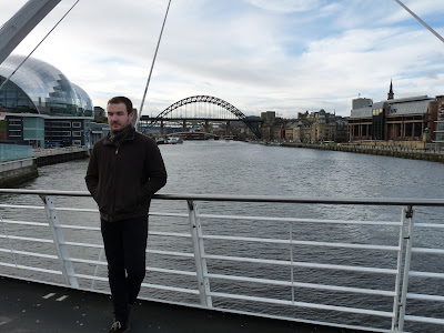
Chosen article photo

This is the photo I have chosen to use for my double page spread and main story.
Sunday 3 January 2016
Possible article photos
We headed down to the Quayside to take photos one afternoon for my double page spread. I moved away from using the green room in school as sometimes the lighting can affect the photo taken. These are some of the possible photos I could use for my article.


Article
I have written my article on Microsoft word and will then transfer it onto InDesign. I have chosen to do an interview between a journalist and my main story star 'Kai Turner'.


Saturday 2 January 2016
NEW double page flat plan
After careful consideration, I have decided to change the layout of my article. At first this was the flat plan for it;
 However I have decided not to use three different images and instead take a landscape photo of my artist in a different location, not the green room. So now my flat plan for this is;

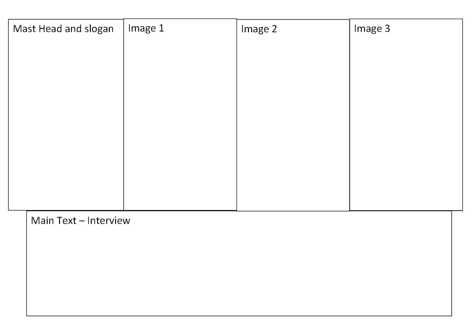

Double Page Spread Idea
I am currently writing my article for the double page spread and have decided the name of my artist will be 'Kai Turner' and will be going solo from being part former boy band 'Horizon' for several years that have had great success in the past years. The article will be an interview with the artist talking about his latest projects and his feelings after leaving the band.
Subscribe to:
Posts (Atom)